4.4. Render Properties Overview
In this tutorial we will go over all the options available in the Render Properties tab.
The data inputs displayed below the Visualization Pipeline Browser are always directly linked to the selected geometry in the tree. This means you can only view and edit settings for one geometry at a time.
Render Properties Toolbar
The Render Properties toolbar holds quick controls for commonly used functionality.
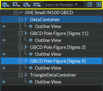
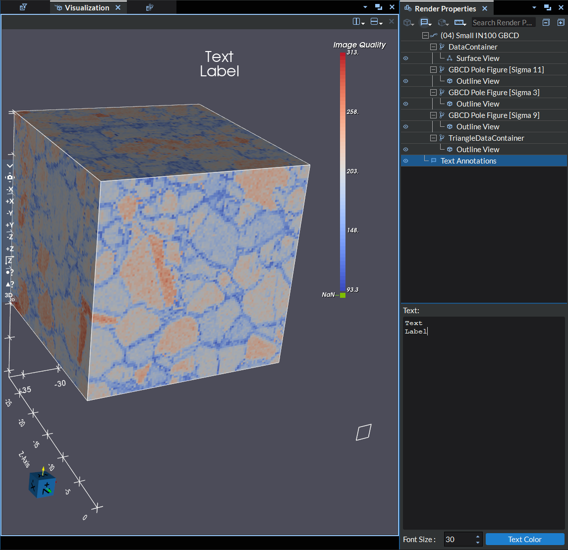
Figure 4.17 Display Settings Properties Tab
The available controls include the following:
The Clip (
 ), Slice (
  ),
Threshold (
),
Threshold (  ) and Quadric Clustering (
  ) buttons:
These buttons allow you to apply different types of filters to your geometry.
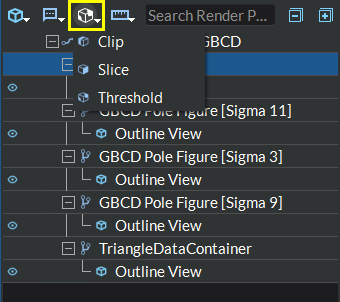
Figure 4.18 Filter Buttons Toolbar
For more details on how to use these filters see Applying Filters.
The Outline (
 ), Points (
 ), Wireframe (
 ),
Surface (
),
Surface ( ), 2D Image/Slice (
 ), Volume (
 ), and Glyph (
 ) buttons
allow you to apply different types of data views to visualize your geometry.
) buttons
allow you to apply different types of data views to visualize your geometry.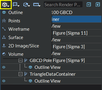
Figure 4.19 Data View Buttons Toolbar
For more details on how to use these data views see Creating Data Views.
The Global Annotation (
 ) button allows you to apply a various
types of annotations to the render window.
) button allows you to apply a various
types of annotations to the render window.Global Annotation Toolbar Button
Global Annotation Applied
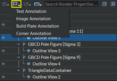
There are three different types of annotations available:
Text Annotation: This allows the user to place a multi-line text label anywhere in the render window. The label can be moved interactively by the user to anywhere in the render window by right clicking the label and dragging to the desired location. The user can also change the text color by clicking the Text Color button or change the font size via the font size input in the widget settings area.
Image Annotation: This allows the user to add an image annotation to the render window. This image label can be moved interactively by the user to anywhere in the render window and can be resized interactively or flipped by the user.
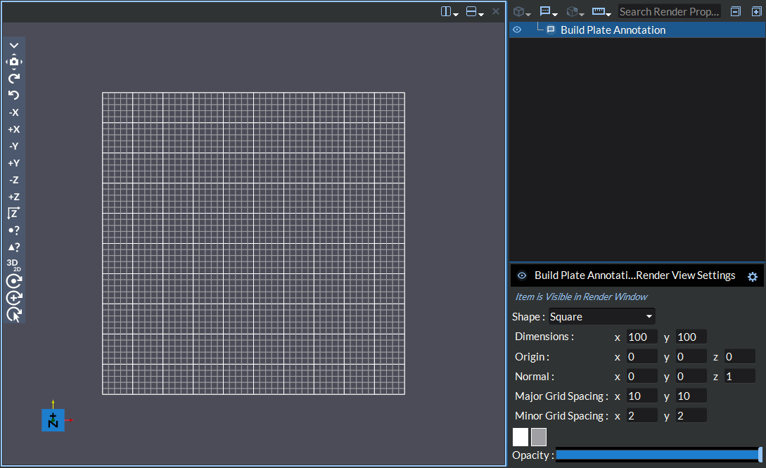
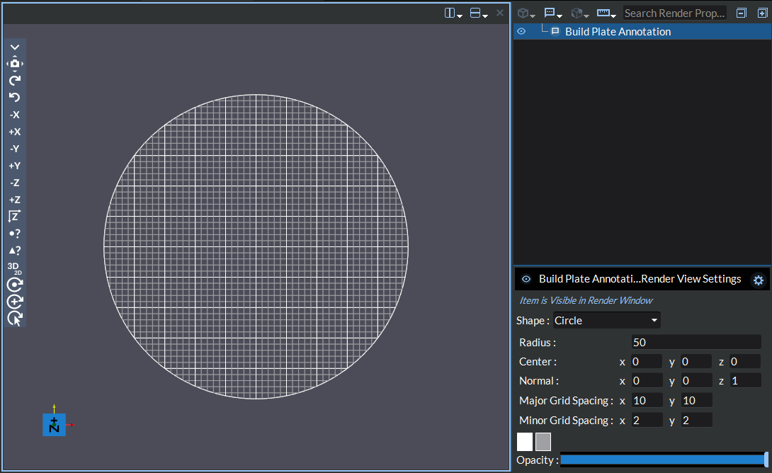
Build Plate Annotation: This allows the user to add a plane to the render window representing a build plate. The user may choose from a rectangular or circular build plate shapes:
Rectangular Build Plate: With a square build plate, you can customize the major and minor grid spacing in the x and y directions, the opacity and the colors of the grid lines, the plane’s normal direction, the height, the width and origin point of the plane
Circular Build Plate: With a circular build plate, you can customize the major and minor grid spacing in the x and y directions, the opacity and the colors of the grid lines, the plane’s normal direction, the radius, the center point and the origin point of the plane.
Caption Annotation: This allows the user to place a multi-line text label attached to an arrow anywhere in the render window. The arrow can be anchored to point anywhere in the render window through one of the following methods;
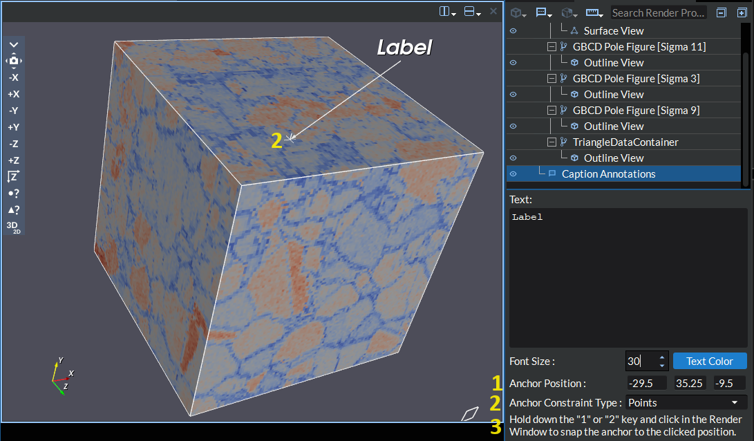
(1) Manually enter coordinate points in the input boxes next to the Anchor Position label in the widget settings area.
(2) Use the free hand selection handle to click and drag the tip of the arrow interactively in the render window to the disired location. For this option, you have several different constraint types (located in the widget settings area) to choose from, each of which will constrain the anchor point in different ways when interactively placing the points. These constraint types are Points (constrains ruler end points to the surface of any visible geometry and will snap to the nearest point if you are close enough to it), Cells (constrains ruler end points to the surface of any cell based geometry), Cell Point Means (constrains ruler end points to the mean of the selected cell’s points for any cell based geometry), Cell Parametric Center (constrains ruler end points to the parametric center of the selected cell for any cell based geometry), None (no constraints to the ruler end points other than to the surface of any visible geometry).
(3) Press and hold the number “1” or “2” keys on your keyboard while clicking in the render window to snap the anchor point to the clicked location. This feature will act similarly to the Points constraint option once a location has been selected by the mouse click. While the “1” or “2” keys are being held, any candidate points being hovered will be highlighted. Note that this feature will only work when the caption annotation item is selected in the Visualization Pipeline Browser tree.
The caption label can also be moved interactively by the user to anywhere in the render window by right clicking the label and dragging to the desired location. The user can also change the text color by clicking the Text Color button or change the font size via the font size input in the widget settings area
Corner Annotation: This allows the user to add text annotations to each of the 4 corners of the render window simultaneously.
Arrow Annotation: This allows the user to manually add custom arrow glyphs that are not defined by a geometry. The arrow glyphs are created by defining the origin point and normal direction vector. You can also copy the arrow glyphs from the table or paste the arrow glyph definitions from an external csv file to quickly create a large number of custom arrow glyphs. This annotation also provides various ways to color the arrows based on the orientations.
Ellipse Annotation: This allows the user to manually add custom ellipse glyphs that are not defined by a geometry. The ellipse glyphs are created by defining the major radius vector (defines the origin of the polar angle and the major radius size), ratio (The ratio of the ellipse defined as minor radius / major radius. Valid values are in the range [0.001, 1.0]), and resolution (number of line segments in the polyline defining the ellipse edge) for all the ellipses as well as the center of the ellipse and a direction vector that is parallel to the ellipse plane for each individual ellipse. You can also copy the ellipse glyphs from the table or paste the ellipse glyph definitions from an external csv file to quickly create a large number of custom ellipse glyphs.
Image Annotation: This allows the user to add an image annotation to the render window. This image label can be moved interactively by the user to anywhere in the render window and can be resized interactively by the user.
Text Annotation: This allows the user to place a multi-line text label anywhere in the render window. The label can be moved interactively by the user to anywhere in the render window by right clicking the label and dragging to the desired location. The user can also change the text color by clicking the Text Color button or change the font size via the font size input in the widget settings area.
The Measuring Tools (
 ) button provides tools for measuring items
in the render window. There is currently one measure tool available:
) button provides tools for measuring items
in the render window. There is currently one measure tool available: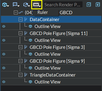
Figure 4.20 Measurement Buttons Toolbar
Ruler: This allows the user to choose two endpoints in order to obtain the distance between them. There are several different ways of selecting the endpoints of the ruler;
Manually enter coordinate points in the input boxes next to the Point 1 and Point 2 labels in the widget settings area.
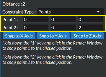
Figure 4.21 Ruler Tool Enter Manual Coordinates
Use the free hand selection handle to click and drag each endpoint interactively in the render window to the disired location. For this option, you have several different constraint types to choose from, each of which will constrain the end points in different ways when interactively placing the points. These constraint types are Points (constrains ruler end points to the surface of any visible geometry and will snap to the nearest point if you are close enough to it), Cells (constrains ruler end points to the surface of any cell based geometry), Cell Point Means (constrains ruler end points to the mean of the selected cell’s points for any cell based geometry), Cell Parametric Center (constrains ruler end points to the parametric center of the selected cell for any cell based geometry), None (no constraints to the ruler end points other than to the surface of any visible geometry).
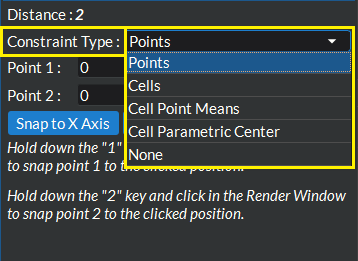
Figure 4.22 Ruler Tool Interactive Drag End Points
Press and hold the number “1” or “2” keys on your keyboard while clicking in the render window to snap end points 1 and 2 respectively to the clicked location. This feature will act similarly to the Points constraint option once a location has been selected by the mouse click. While the “1” or “2” keys are being held, any candidate points being hovered will be highlighted. Note that this feature will only work when the ruler tool item is selected in the Visualization Pipeline Browser tree.
Use any of the above 3 methods in conjunction with the Snap to Axis buttons. Each of these three buttons will snap the end points to lie along the x, y, or z axes.
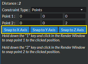
Figure 4.23 Ruler Tool Snap To Axis Buttons
The Expand/Collapse All buttons (
 and
and  )
allow you to expand and collapse all of the items in the pipeline browser tree view.
)
allow you to expand and collapse all of the items in the pipeline browser tree view.
Visualization Pipeline Browser
The Visualization Pipeline Browser is a tree that contains all the pipelines (with their geometries) currently loaded into the view(s). The tree also contains each geometry’s filters and data views, as well as any global annotations.
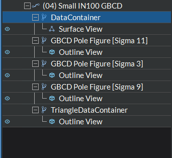
Figure 4.24 Visualization Pipeline Browser
The Visualization Pipeline Browser tree has an item hover feature for certain item types that are viewable in the render window (data views and build plate annotations) in which an item hovered by the mouse in the tree and is currently visible in the render window will be highlighted in the render window using a colored outline of the data set.
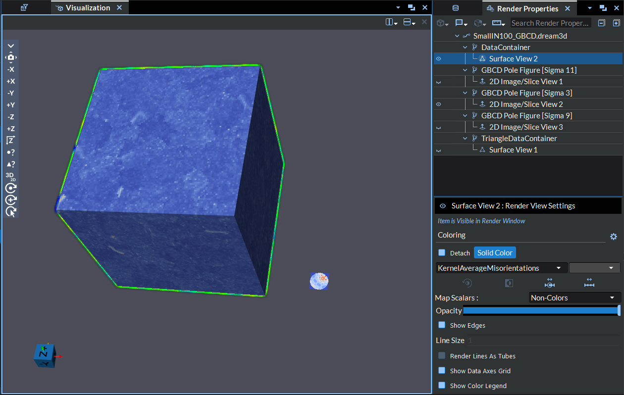
Figure 4.25 Visualization Pipeline Geometry Highlighting
Automatic Selection When Switching Views
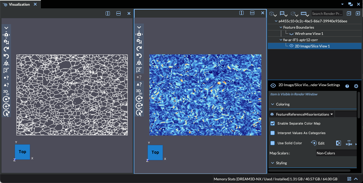
Figure 4.26 A split view where the right render window has a single visible data view that is automatically selected in the tree with its settings panel displayed.
When you click on a different Render Window to make it the active view, the Visualization Pipeline Browser automatically updates its visibility checkboxes to reflect which data views are visible in that window. If exactly one data view is visible in the newly active view, it will be automatically selected in the tree so that its settings panel appears immediately — there is no need to manually click the item. If two or more data views are visible, no automatic selection occurs and you can choose which item to inspect.
The Visualization Pipeline Browser tree also has a few contextual menu options, depending on the item that is currently selected:
Load File - Loads geometries found in the given file into the Visualization Pipeline Browser tree.
Reload File - This will allow the user to manually reload the selected file while preserving existing filters & data views where possible.
Enable/Disable Auto Reload - This will enable or disable automatic reloading for the selected file anytime the file is modified while preserving existing filters & data views where possible.
Add Filter sub-menu - Convenient menu used to add a filter to the currently selected geometry or filter.
Add Data View sub-menu - Convenient menu used to add a representation to the currently selected geometry or filter.
Change Data View submenu: Allows the user to change the current DataView into a different DataView.
Show Dataset Information - Displays general information about the currently selected representation’s underlying geometry.
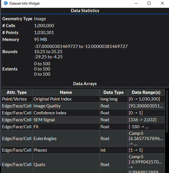
The Data Statistics section provides various statistics about the geometry. In order, these statistics include:
the type of geometry
number of cells in the geometry
number of points in the geometry
the actual size of the data (this refers to the data set after any arrays have been applied)
the coordinate bounds of the geometry in each direction
The Data Arrays section provides a table listing all the data arrays that have been applied to the geometry, along with their data types, their attribute types, and their data ranges.
Copy - This will allow the user to copy to the clipboard the entire selected item in order create a new copy of it in the tree. This feature is currently only available for build plate annotation items.
Paste - This will allow the user to paste a new copy of an item that has been copied to the clipboard. This feature is currently only available for build plate annotation items.
Copy Settings - This will allow the user to copy all of the selected item’s settings to the clipboard. You may only copy the settings from a single item at a time. The only items available for copying are data Views, filters, data sources, and build plate annotations.
Paste Settings - This will allow the user to paste the settings copied to the clipboard from another item into the compatible selected item(s). You may paste into as many items as you like at a time. Any selected items with compatible settings will paste the clipboard setting values into it’s settings, otherwise the item will be skipped. The only items available for pasting are data Views, filters, data sources, and build plate annotations.
Save - This will allow the user to save the selected geometry data to an appropriate vtk file.
Rename - This will allow the user to change the name of the selected item in the tree view.
Create Preset - This allows the user to create a visualization preset out oof the selected item and all of it’s children. A visualization preset allows you to apply a series of filter and data view settings that are used often, all in one shot.
A visualization preset can be created from a geometry (data source) item or a filter item. The preset will include all child filters & data views of the item selected for creating the preset. The preset may optionally include the render window state. If not including the render window state, the settings for the data views in the active window will be saved for the preset. When saving a preset, you will be asked to give it a name to use for referencing it later when applying.
Apply Preset - This allows the user to apply a previously created visualization preset to the selected item. A preset can be applied to any geometry (data source) or filter item. Depending on the preset and if you have render window splits prior to applying a preset, you may lose some of your current data when applying the preset.
Delete Preset(s) - This allows the user to delete a previously created visualization preset.
Expand All - Expands all pipeline browser tree items
Collapse All - Collapses all pipeline browser tree items
Delete Item and Children - Deletes the currently selected tree item and removes its corresponding visual data from the rendering window.
Render View Settings
The Render View Settings section is located just underneath the Visualization Pipeline Browser. It contains all the controls needed for the currently selected item in the Visualization Pipeline Browser tree.
For more details on the controls that appear for currently selected data views, see Creating Data Views.
For more details on the controls that appear for currently selected filters, see Applying Filters.
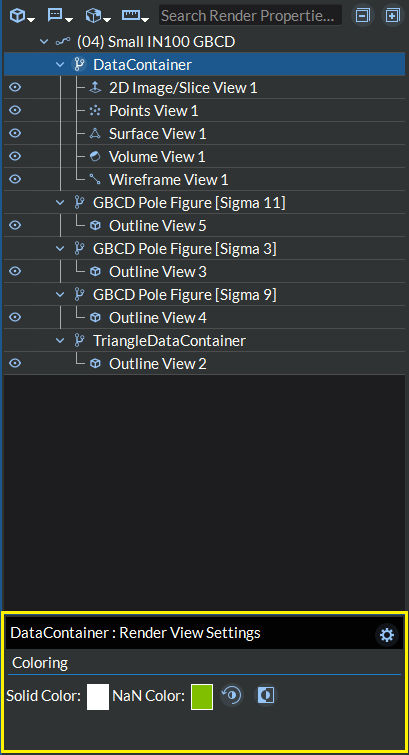
Figure 4.27 Render View Settings
The Render View Settings section for each geometry (data source),
filter, and data view item will have a title bar with the item’s unique name, a
settings button ( ) located in the upper right hand
corner as well as any controls specific to that item. Data view items will also have
a visibility hint banner directly beneath the title bar stating whether the selected
item is currently visible in the render window or not along with a visibility button (
) located in the upper right hand
corner as well as any controls specific to that item. Data view items will also have
a visibility hint banner directly beneath the title bar stating whether the selected
item is currently visible in the render window or not along with a visibility button ( )
located in the left hand side of the title bar which allows the user to toggle the visibility
of this item in the render window. The settings button allows you to save the current values
of all the settings (not specific to arrays) in the selected item as the default values when
adding a new version of that item type. This is not to be confused with the copy and paste setting
features accessible from the context menu (as described above) which will copy and paste only the selected items.
You can restore these setting values back to the application’s default at any time by clicking the reset button
in the pop up dialog that appears when you press the button.
)
located in the left hand side of the title bar which allows the user to toggle the visibility
of this item in the render window. The settings button allows you to save the current values
of all the settings (not specific to arrays) in the selected item as the default values when
adding a new version of that item type. This is not to be confused with the copy and paste setting
features accessible from the context menu (as described above) which will copy and paste only the selected items.
You can restore these setting values back to the application’s default at any time by clicking the reset button
in the pop up dialog that appears when you press the button.
In the above example, the geometry DataContainer is selected, and controls to color the DataContainer geometry are displayed. These controls include:
Solid Color: These buttons will open a dialog [image below] in which the user can customize the default coloring of the geometry when Solid Color is selected for the color by array.
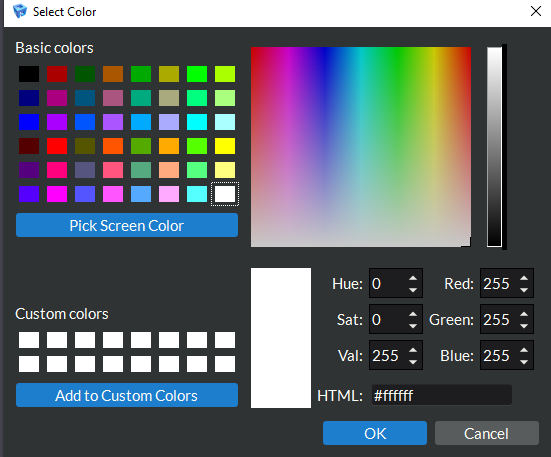
Figure 4.28 Select Color
Edit
 : This button will do one of three different things depending on the context.
When you are clicked on a data source item or are clicked on a data view item with a data array active, this button will allow you to change the default lookup table when it is being used for color mapping the active array scalar values. When clicked, a dialog box will open showing a list of preset color mappings to choose from. You can use the search bar at the top to search the list by name or color space for a specific preset. You can also click the star icons to the left of each preset to add them to your list of favorites and then use the drop down menu next to the search bar to filter down the list to your favorites.
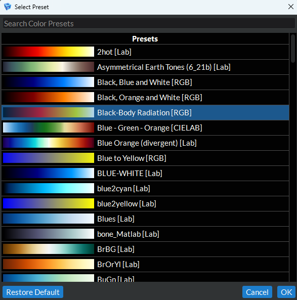
Figure 4.29 Select Color Preset
When you are clicked on a data view item with the Solid Color array active, this button will allow you to change the solid color when it is being used for coloring the geometry. When clicked, a dialog box just like the one from item number 1 above will open allowing the user to customize the default coloring of the geometry when Solid Color is selected for the color by array.
When you are clicked on a data view item with a data array active and the Interpret Values As Categories checkbox checked, this button will allow you to change the default lookup table when it is being used for indexed (categorical) color mapping the active array scalar values. When clicked, a dialog box will open showing 2 tabs. The first tab has a list of preset indexed color mappings to choose from. You can click the star icons to the left of each preset to add them to your list of favorites and then use the drop down menu at the top right hand side of the list to filter down the list to your favorites.
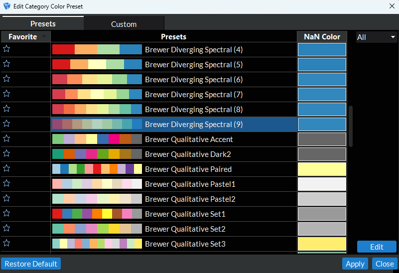
Figure 4.30 Select Indexed Color Preset
The second tab allows you to create your own custom indexed color map by either creating your own from scratch using the add, remove, and remove all buttons along the right hand side of the tab or by editing an existing preset (to do this go to the Presets tab, click on the preset you want to edit, and click the Edit button). Once you have created your custom indexed color map, you can save it for future use by clicking the save button on the right hand side of the tab (make sure you have named your preset using a unique name before you save).
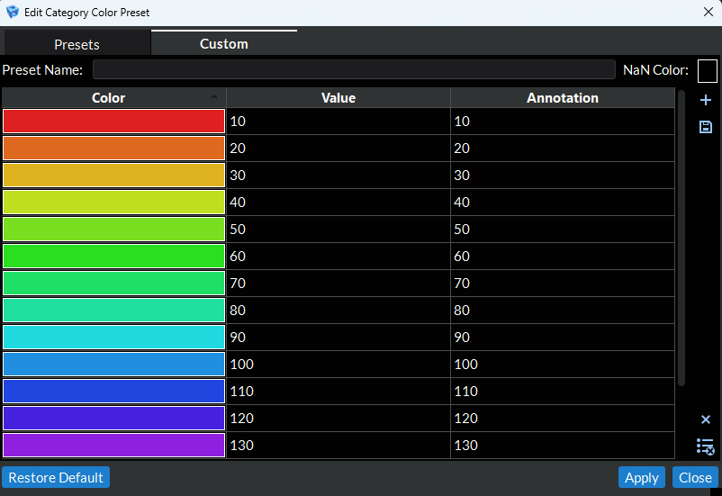
Figure 4.31 Customize Indexed Color Preset
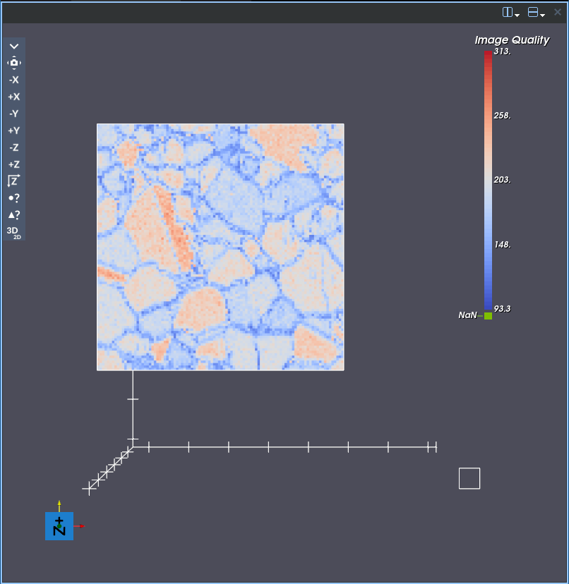
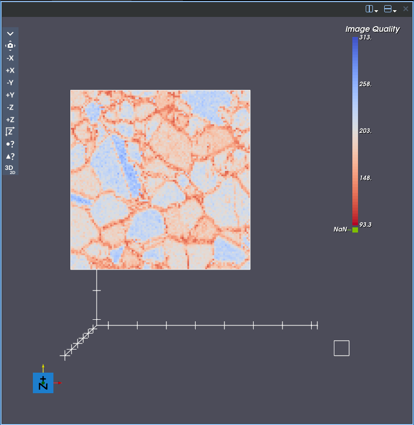
Invert
 : This button will invert the current color mapping for
the active color by array.
: This button will invert the current color mapping for
the active color by array.Normal
Inverted
Sync
 : This will go through all child data views recursively and connect their color map settings to this geometry.