4.6. Creating Data Views
In this tutorial, we will be covering the various types of data views that can be applied to geometries and filters.
The available data views are:
Outline
Points
Wireframe
Surface
2D Image/Slice
Volume
Glyph
Outline View
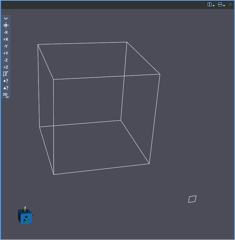
Outline provides a basic, non-detailed view of the data by rendering only the bounding box of the geometry. It’s a useful way to see the overall extent and position of the dataset without visualizing its detailed structure.
The Outline representation has the following controls:
Outline Default Settings 
Use this to save the current values of all the settings in the selected item as the default values when adding a new outline representation. You can restore these values back to the application’s default at any time by clicking the reset button in the pop up dialog that appears when you press the button.
Outline Help 
Opens this help page to the outline representation section.
Enable Separate Outline Color Map
When checked, this creates a separate color map from the parent geometry which can then be edited independently from the other data views.
Go To Outline Parent Geometry 
This will automatically take you to the
Render View Settings for the parent geometry to this representation.
You can find the parent geometry manually by working up the Visualization Pipeline Browser tree
from the existing data view until you reach the parent item with the icon next to it.
Solid Color
Use this to pick a solid color to color the representation with when separate color map is enabled.
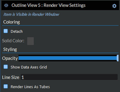
Outline Opacity
Sets the opacity for the representation, which allows the adjustment of the transparency of the representation.
Outline Line Size
Sets the line size for the representation
Outline Render Lines As Tubes
Renders the lines as tubes, which can make it easier to see the lines.
Show Outline Data Axes Grid
Displays an XYZ grid showing where the bounds of the representation start and end.
Outline Edit Data Axes Grid
Opens a dialog to allow editing the tick mark spacing and grid lines visibility for the data axes grid on this representation.
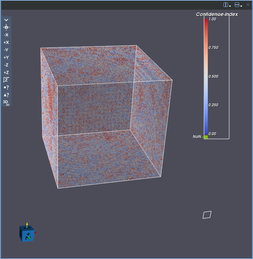
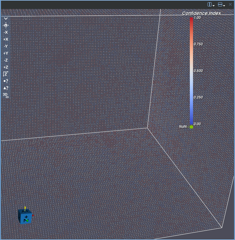
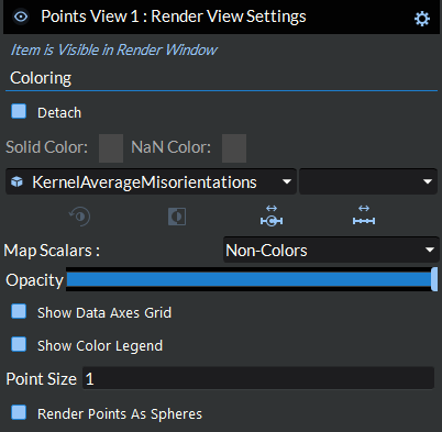
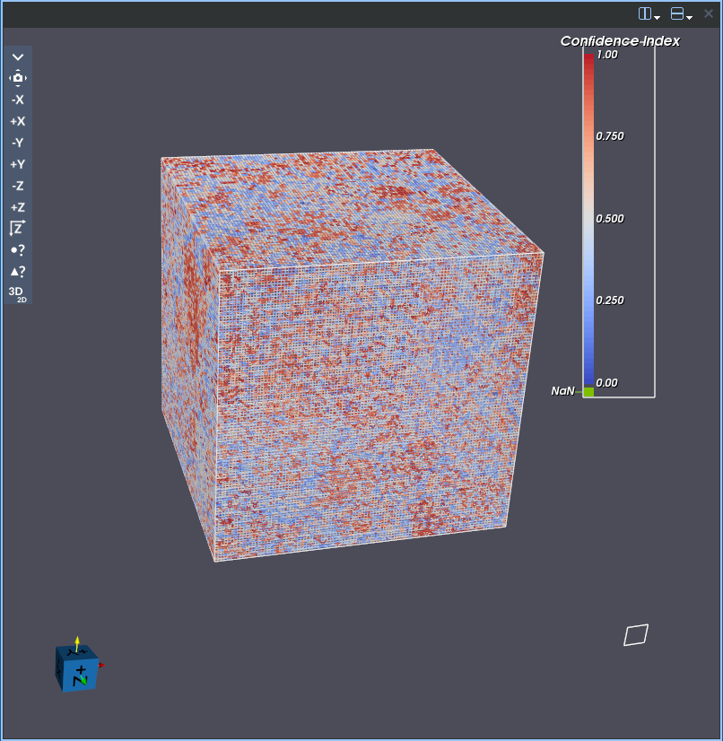
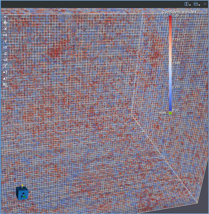
Points View
Points representation displays the data as a set of individual points at the vertices of the dataset. This can be useful when you want to see the distribution of points or focus on specific locations within the data without considering the connections between them.
Points Representation |
Points Representation (Zoomed) |
|---|---|
|
|
The Points representation has the following controls:
Points Default Settings
Use this to save the current values of all the settings (not specific to arrays) in the selected item as the default values when adding a new point representation. You can restore these values back to the application’s default at any time by clicking the reset button in the pop up dialog that appears when you press the button.
Points Help
Opens this help page to the points representation section.
Points Color By Array
Pick the data array that will be used to color the dataset.
Points Color By Component
Pick the data array component that will be used to color the dataset.
Enable Separate Points Color Map
When checked, this creates a separate color map from the parent geometry which can then be edited independently from the other data views.
Go To Points Parent Geometry
This will automatically take you to the Render View Settings for the parent geometry to this representation. You can find the parent geometry manually by working up the Visualization Pipeline Browser tree from the existing data view until you reach the parent item with the
Use Solid Color Points
Use solid color to color the dataset.
Interpret Points Values As Categories
When checked, this will switch the color map to indexed lookup mode (i.e. categorical colors).
Edit Points Preset 
Edit the preset color mapping when separate color map is enabled.
Points Invert 
Invert the current color mapping when separate color map is enabled.
Points Custom Range 
Scale the data’s color mapping to a custom user defined range.
Points Scale To Data 
Scale the data’s color mapping to the ranges in the active color by array
Points Map Scalars
Maps scalar values in a dataset to colors using the selected color map. When enabled, it translates scalar data into visual form, allowing variations in the data to be observed through color.
Points Opacity
Sets the opacity for the representation, which allows the adjustment of the transparency of the representation.
Point Size
Sets the point size that all the points in the representation will use.
Render Points As Spheres
Renders the points as spheres, which can make it easier to see all the points.
Show Points Color Legend
Shows/hides the color legend, the vertical bar to the right of the dataset.
Show Points Data Axes Grid
Displays an XYZ grid showing where the bounds of the representation start and end.
Points Edit Data Axes Grid
Opens a dialog to allow editing the tick mark spacing and grid lines visibility for the data axes grid on this representation.
Use Points Decimation During Interactions
When checked, the decimated version of the geometry using the following inputs will be used when interacting with the geometry in the render window.
Points Number of Bins
Specifies the number of bins along the X, Y, and Z axes of the data set. A higher number means a higher fidelity.
Points Use Internal Triangles
If checked, triangles completely contained in a spatial bin will be included in the computation of the bin’s quadrics. If not checked, the filters operates faster but the resulting surface may not be as well-behaved.
Points Array Histogram
This chart displays a histogram of the actively selected data array and component.
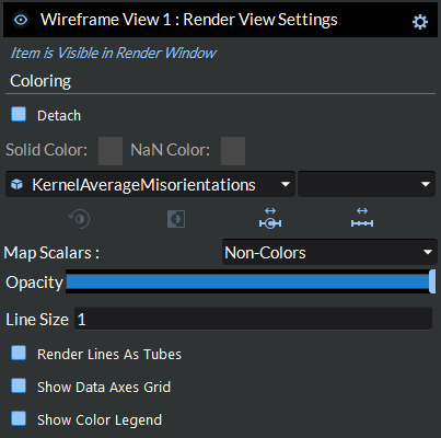
Wireframe View
Wireframe representation visualizes the data as lines connecting the vertices, forming edges and faces but without filling them. It gives an impression of the 3D structure and connectivity of the data without obscuring the view of what might be inside.
Wireframe Representation |
Wireframe Representation (Zoomed) |
|---|---|
|
|
The Wireframe representation has the following controls:
Wireframe Default Settings
Use this to save the current values of all the settings (not specific to arrays) in the selected item as the default values when adding a new wireframe representation. You can restore these values back to the application’s default at any time by clicking the reset button in the pop up dialog that appears when you press the button.
Wireframe Help
Opens this help page to the wireframe representation section.
Wireframe Color By Array
Pick the data array that will be used to color the dataset.
Wireframe Color By Component
Pick the data array component that will be used to color the dataset.
Enable Separate Wireframe Color Map
When checked, this creates a separate color map from the parent geometry which can then be edited independently from the other data views.
Go To Wireframe Parent Geometry
This will automatically take you to the Render View Settings for the parent geometry to this representation. You can find the parent geometry manually by working up the Visualization Pipeline Browser tree from the existing data view until you reach the parent item with the
Use Solid Color Wireframe
Use solid color to color the dataset.
Interpret Wireframe Values As Categories
When checked, this will switch the color map to indexed lookup mode (i.e. categorical colors).
Edit Wireframe Preset
Edit the preset color mapping when separate color map is enabled.
Wireframe Invert
Invert the current color mapping when separate color map is enabled.
Wireframe Custom Range
Scale the data’s color mapping to a custom user defined range.
Wireframe Scale To Data
Scale the data’s color mapping to the ranges in the active color by array
Wireframe Map Scalars
Maps scalar values in a dataset to colors using the selected color map. When enabled, it translates scalar data into visual form, allowing variations in the data to be observed through color.
Wireframe Opacity
Sets the opacity for the representation, which allows the adjustment of the transparency of the representation.
Wireframe Line Size
Sets the line size for the representation
Wireframe Render Lines As Tubes
Renders the lines as tubes, which can make it easier to see the lines.
Show Wireframe Color Legend
Shows/hides the color legend, the vertical bar to the right of the dataset.
Show Wireframe Data Axes Grid
Displays an XYZ grid showing where the bounds of the representation start and end.
Wireframe Edit Data Axes Grid
Opens a dialog to allow editing the tick mark spacing and grid lines visibility for the data axes grid on this representation.
Use Wireframe Decimation During Interactions
When checked, the decimated version of the geometry using the following inputs will be used when interacting with the geometry in the render window.
Wireframe Number of Bins
Specifies the number of bins along the X, Y, and Z axes of the data set. A higher number means a higher fidelity.
Wireframe Use Internal Triangles
If checked, triangles completely contained in a spatial bin will be included in the computation of the bin’s quadrics. If not checked, the filters operates faster but the resulting surface may not be as well-behaved.
Wireframe Array Histogram
This chart displays a histogram of the actively selected data array and component.
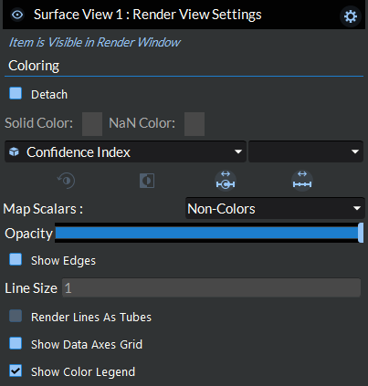
Surface View
Surface representation renders the exterior surfaces of the data as filled cells, providing a complete view of the outer shape and contours. It’s commonly used for visualizing the external form of simplnx geometries.
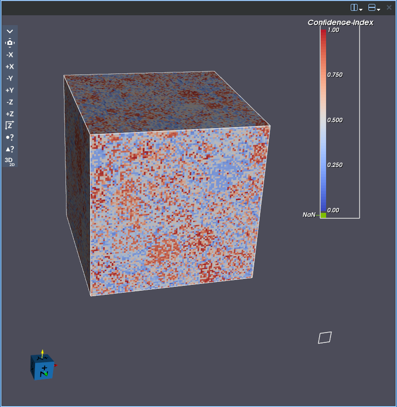
The Surface representation has the following controls:
Surface Default Settings
Use this to save the current values of all the settings (not specific to arrays) in the selected item as the default values when adding a new surface representation. You can restore these values back to the application’s default at any time by clicking the reset button in the pop up dialog that appears when you press the button.
Surface Help
Opens this help page to the surface representation section.
Surface Color By Array
Pick the data array that will be used to color the dataset.
Surface Color By Component
Pick the data array component that will be used to color the dataset.
Enable Separate Surface Color Map
When checked, this creates a separate color map from the parent geometry which can then be edited independently from the other data views.
Go To Surface Parent Geometry
This will automatically take you to the Render View Settings for the parent geometry to this representation. You can find the parent geometry manually by working up the Visualization Pipeline Browser tree from the existing data view until you reach the parent item with the
Use Solid Color Surface
Use solid color to color the dataset.
Interpret Surface Values As Categories
When checked, this will switch the color map to indexed lookup mode (i.e. categorical colors).
Edit Surface Preset
Edit the preset color mapping when separate color map is enabled.
Surface Invert
Invert the current color mapping when separate color map is enabled.
Surface Custom Range
Scale the data’s color mapping to a custom user defined range.
Surface Scale To Data
Scale the data’s color mapping to the ranges in the active color by array
Surface Map Scalars
Maps scalar values in a dataset to colors using the selected color map. When enabled, it translates scalar data into visual form, allowing variations in the data to be observed through color.
Surface Opacity
Sets the opacity for the representation, which allows the adjustment of the transparency of the representation.
Show Edges
Shows the edges of the cells in the representation. This is equivalent to Paraview’s Surface With Edges representation.
Surface Line Size
Sets the line size for the representation. This control is only enabled if Show Edges is enabled.
Surface Render Lines As Tubes
Renders the lines as tubes, which can make it easier to see the lines.
Back Face Culling
Turns on fast culling of polygons based on orientation of normal with respect to camera. If back face culling is on, polygons facing away from camera are not drawn.
Show Surface Color Legend
Shows/hides the color legend, the vertical bar to the right of the dataset.
Show Surface Data Axes Grid
Displays an XYZ grid showing where the bounds of the representation start and end.
Surface Edit Data Axes Grid
Opens a dialog to allow editing the tick mark spacing and grid lines visibility for the data axes grid on this representation.
Use Surface Decimation During Interactions
When checked, the decimated version of the geometry using the following inputs will be used when interacting with the geometry in the render window.
Surface Number of Bins
Specifies the number of bins along the X, Y, and Z axes of the data set. A higher number means a higher fidelity.
Surface Use Internal Triangles
If checked, triangles completely contained in a spatial bin will be included in the computation of the bin’s quadrics. If not checked, the filters operates faster but the resulting surface may not be as well-behaved.
Surface Array Histogram
This chart displays a histogram of the actively selected data array and component.
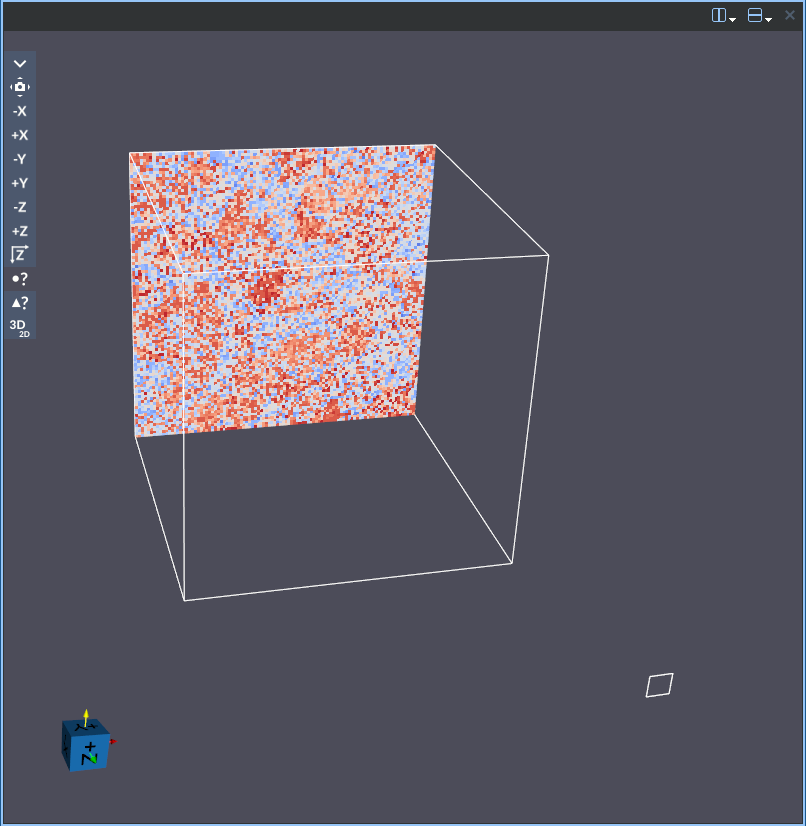
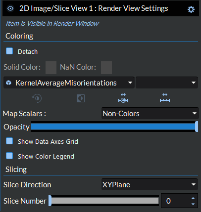
2D Image/Slice View
2D Image/Slice is a specialized representation that cuts through the data using a plane or other geometric shape, showing a cross-section. It allows you to inspect internal structures at specific locations without the need to render the whole volume, providing insight into what’s inside. This representation is achieved by texture mapping the data in the render window and thus it is recommended to use this representation wherever possible for (large) image geometries.
This representation has the following controls:
2D Image/Slice Default Settings
Use this to save the current values of all the settings (not specific to arrays) in the selected item as the default values when adding a new slice representation. You can restore these values back to the application’s default at any time by clicking the reset button in the pop up dialog that appears when you press the button.
2D Image/Slice Help
Opens this help page to the 2D Image/Slice representation section.
2D Image/Slice Color By Array
Pick the data array that will be used to color the dataset.
2D Image/Slice Color By Component
Pick the data array component that will be used to color the dataset.
Enable Separate 2D Image/Slice Color Map
When checked, this creates a separate color map from the parent geometry which can then be edited independently from the other data views.
Go To 2D Image/Slice Parent Geometry
This will automatically take you to the Render View Settings for the parent geometry to this representation. You can find the parent geometry manually by working up the Visualization Pipeline Browser tree from the existing data view until you reach the parent item with the
Use Solid Color 2D Image/Slice
Use solid color to color the dataset.
Interpret 2D Image/Slice Values As Categories
When checked, this will switch the color map to indexed lookup mode (i.e. categorical colors).
Edit 2D Image/Slice Preset
Edit the preset color mapping when separate color map is enabled.
2D Image/Slice Invert
Invert the current color mapping when separate color map is enabled.
2D Image/Slice Custom Range
Scale the data’s color mapping to a custom user defined range.
2D Image/Slice Scale To Data
Scale the data’s color mapping to the ranges in the active color by array
2D Image/Slice Map Scalars
Maps scalar values in a dataset to colors using the selected color map. When enabled, it translates scalar data into visual form, allowing variations in the data to be observed through color.
2D Image/Slice Opacity
Sets the opacity for the representation, which allows the adjustment of the transparency of the representation.
Show 2D Image/Slice Color Legend
Shows/hides the color legend, the vertical bar to the right of the dataset.
Show 2D Image/Slice Data Axes Grid
Displays an XYZ grid showing where the bounds of the representation start and end.
2D Image/Slice Edit Data Axes Grid
Opens a dialog to allow editing the tick mark spacing and grid lines visibility for the data axes grid on this representation.
Link Slices 
Opens a dialog allowing you to link the slice number from this view to that of one or more other 2D Image Slice Views. You may link any number of views together this way but you cannot create multiple separate sets of links. To remove a view from the link set, simply click this button again.
Link Physical Units
When linking slices between slice views, this option will allow you to link the slices by the physical position rather than the slice number. If there is no overlapping coordinates between the data sets, it will use the closest slice. When using this feature, all of the linked slices will now be linked by physical units and all of the slices will be updated to use the same slice direction.
Slice Direction
Sets the 2D plane that the resulting slice will come from. Changing this control resets the Slice Number control.
Slice Number
Sets the slice number that will be shown on application of this filter.
Duration
Defines how long the timer will wait at each slice during the play all and flicker animations.
Flicker 
Allows the user to automatically switch between two different slices defined by the slice numbers entered in the input boxes for the duration amount entered in the duration input box.
Play All
Allows the user to play an animation loop of all the slices in the current slice direction.
Slice Array Histogram
This chart displays a histogram of the actively selected data array and component. This histogram shows the data from the active array across the entire data set, not just the current slice.
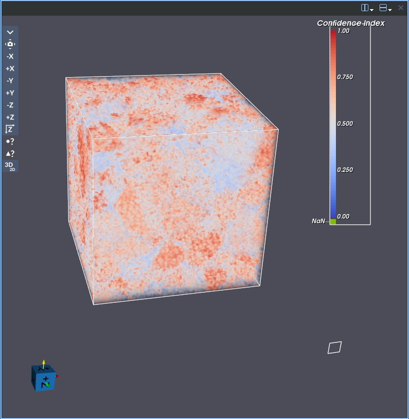
Volume View
Volume representation visualizes the entire 3D structure, including internal features, by mapping scalar values to color and opacity. Unlike surface data views that only show the exterior, volume rendering uses a transfer function to assign both color and transparency to every voxel in the dataset. This makes it possible to reveal internal structures such as pores, phases, or density gradients that would otherwise be hidden. Volume rendering is available only on Image Geometries.
The Volume representation has the following controls:
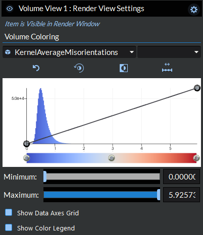
Volume Coloring
Volume Default Settings
Saves the current values of all settings as the default values when adding a new volume representation. You can restore these values back to the application’s default at any time by clicking the reset button in the pop-up dialog that appears when you press the button.
Volume Help
Opens this help page to the volume representation section.
Volume Coloring (Array Combobox)
Selects which data array is used to drive the color and opacity mapping. All cell and point arrays attached to the geometry are available in the drop-down list.
Volume Coloring (Component Combobox)
When the selected array has multiple components (e.g. a vector or tensor), this drop-down selects which component to visualize. The first entry is Magnitude, which computes the L2 norm across all components.
Reset 
Resets the color transfer function and scalar opacity function for the active array back to their default state (full-range linear ramp for opacity, default color preset for color).
Edit Colormap Preset
Opens the color preset dialog, allowing you to choose a predefined color map (e.g. Cool to Warm, Rainbow, Grayscale) for volume rendering. The color bar and 3D view update immediately when a preset is applied.
Invert
Reverses the direction of the current color map. For example, a blue-to-red gradient becomes red-to-blue.
Scale To Data
Rescales the color and opacity transfer functions to cover the full data range of the active array and component. Use this to undo a custom range and return to the natural data extent.
Histogram / Opacity Editor
The histogram/opacity editor is the central interactive widget for controlling how the volume is rendered. It combines three elements in a single view:
Histogram bars (gray) showing the distribution of values in the active data array.
Opacity curve (white line with draggable control points) defining how transparent each data value is in the 3D view. A value of 1.0 means fully opaque; 0.0 means fully transparent.
Color gradient bar (bottom strip) showing the current color transfer function, with draggable color control points.
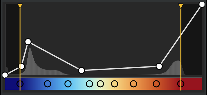
Opacity Curve Interaction
- Add a control point
Double-click in the histogram area at the desired data value and opacity level. A new control point is inserted.
- Move a control point
Left-click and drag a control point. Interior points can be moved both horizontally (data value) and vertically (opacity). The first and last points are locked horizontally and can only be moved vertically.
- Remove a control point
Middle-click on a control point to remove it. The first and last points cannot be removed.
Color Bar Interaction
- Add a color control point
Double-click in an empty area of the color bar. A new point is created at the clicked position, and a color picker dialog opens so you can choose its color. If you cancel the dialog, the point is removed.
- Edit a color control point
Double-click on an existing color control point to open the color picker and change its color.
- Select a color control point
Single-click on a color control point to select it (shown with a blue highlight ring). Press Enter or Return to open the color picker for the selected point.
- Remove a color control point
Select the point then press Delete or Backspace, or middle-click the point. The first and last color points cannot be removed. A minimum of two color points is always maintained.
- Deselect
Left-click on empty space in the histogram area (without holding Shift) to deselect the currently selected color point.
Range Lines (Custom Data Range)
Two vertical yellow lines with triangular handles at the top of the histogram define the active data range. The region outside the range lines is dimmed. Dragging a range line rescales the color and opacity mapping in the 3D view so that the full color gradient is compressed into the range defined by the two lines.
- Drag a range line
Left-click and drag one of the yellow handles or lines to adjust the minimum or maximum of the custom range. The 3D view updates in real time as you drag.
- Reset range
Right-click the histogram and select Reset Min/Max to restore the range lines to the full data extent.
Keyboard and Mouse Reference
The following table summarizes all mouse and keyboard interactions in the histogram/opacity editor:
Input
Action
Left-click + drag point
Move an opacity or color control point
Left-click + drag range line
Adjust custom data range boundary
Shift + Left-click + drag
Pan the histogram view horizontally
Alt + scroll wheel
Zoom the histogram view in/out (centered on cursor position)
Double-click histogram area
Add a new opacity control point
Double-click color bar
Add a new color control point (opens color picker)
Double-click color point
Edit color of existing point (opens color picker)
Middle-click on point
Remove an opacity or color control point
Delete / Backspace
Remove the selected color control point
Enter / Return
Open color picker for selected color point
Left-click empty space
Deselect the selected color point
Right-click
Open context menu (Reset Original View, Reset Min/Max)
Annotations
Show Color Legend
Shows or hides the color legend (scalar bar) displayed in the 3D render window. The legend shows the mapping between data values and colors.
Show Data Axes Grid
Displays an XYZ grid showing the bounds of the representation. Note: depending on how you define the opacity function, the full dataset bounds may not be visible, so the grid axes may appear offset from what is actually rendered.
Edit Data Axes Grid
Opens a dialog to configure the tick mark spacing and grid line visibility for the data axes grid on this representation.
Decimation
Use Decimation During Interactions
When checked, VTK’s interactive sample distance adjustment is enabled, which lowers the rendering quality during camera interactions (rotate, pan, zoom) for faster frame rates. Full quality is restored automatically when the interaction ends. This does not modify the underlying data.
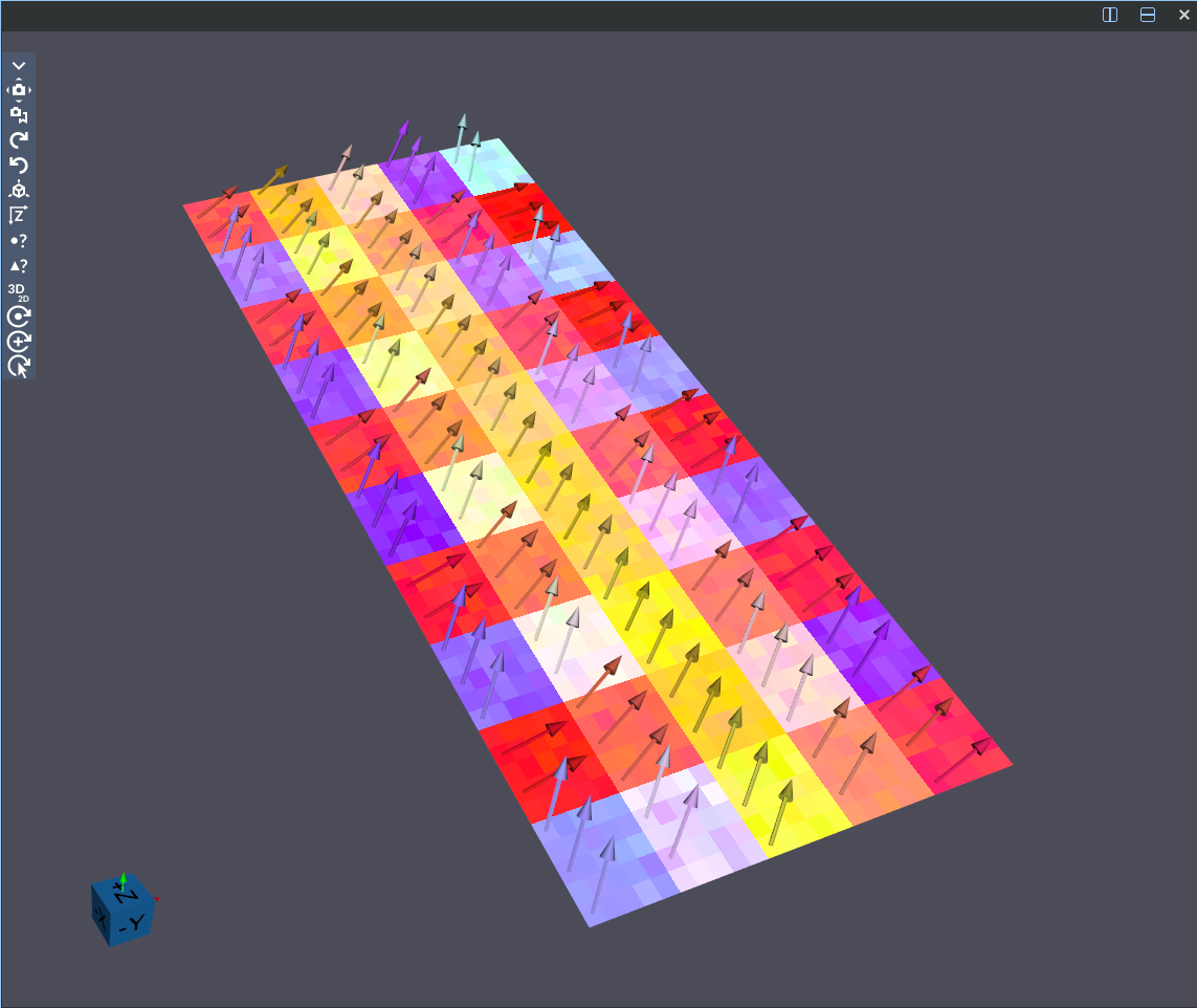
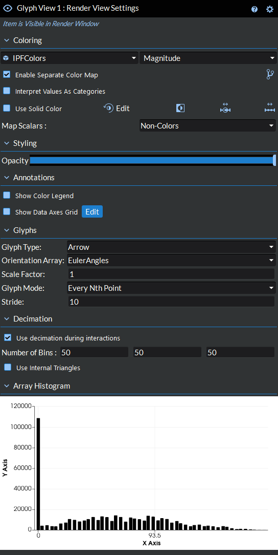
Glyph View
Glyph representation displays glyphs at points or cell centers from the input dataset. The glyphs can be oriented based on selected compatible arrays from the dataset.
The Glyph representation has the following controls:
Glyph Default Settings
Use this to save the current values of all the settings (not specific to arrays) in the selected item as the default values when adding a new point representation. You can restore these values back to the application’s default at any time by clicking the reset button in the pop up dialog that appears when you press the button.
Glyph Help
Opens this help page to the points representation section.
Glyph Color By Array
Pick the data array that will be used to color the glyphs.
Glyph Color By Component
Pick the data array component that will be used to color the glyphs.
Enable Separate Glyph Color Map
When checked, this creates a separate color map from the parent geometry which can then be edited independently from the other data views.
Go To Glyph Parent Geometry
This will automatically take you to the Render View Settings for the parent geometry to this representation. You can find the parent geometry manually by working up the Visualization Pipeline Browser tree from the existing data view until you reach the parent item with the
Use Solid Color Glyphs
Use solid color to color the glyphs.
Interpret Glyphs Values As Categories
When checked, this will switch the color map to indexed lookup mode (i.e. categorical colors).
Edit Glyphs Preset
Edit the preset color mapping when separate color map is enabled.
Glyph Invert
Invert the current color mapping when separate color map is enabled.
Glyph Custom Range
Scale the data’s color mapping to a custom user defined range.
Glyph Scale To Data
Scale the data’s color mapping to the ranges in the active color by array
Glyph Map Scalars
Maps scalar values in a dataset to colors using the selected color map. When enabled, it translates scalar data into visual form, allowing variations in the data to be observed through color.
Glyph Opacity
Sets the opacity for the representation, which allows the adjustment of the transparency of the representation.
Show Glyph Color Legend
Shows/hides the color legend, the vertical bar to the right of the glyphs.
Show Glyph Data Axes Grid
Displays an XYZ grid showing where the bounds of the representation start and end.
Glyph Edit Data Axes Grid
Opens a dialog to allow editing the tick mark spacing and grid lines visibility for the data axes grid on this representation.
Glyph Type
This specifies which type of glyph will be placed at each point from the input dataset.
Orientation Array
Selects the input array to use for orienting the glyphs.
Scale Factor
Specifies the constant multiplier used to scale the glyphs.
Glyph Mode
This specifies the mode that will be used to generate glyphs from the dataset.
Stride
Specifies the stride to be used when glyphing by every Nth point.
Max Num of Sample Points
Specifies the maximum number of sample points to use when sampling the space when using any of the three Uniform Spatial Distribution glyph modes.
Seed
Specifies the seed that will be used for generating a uniform distribution of glyph points when any of the three Uniform Spatial Distribution glyph modes.
Use Glyph Decimation During Interactions
When checked, the decimated version of the geometry using the following inputs will be used when interacting with the geometry in the render window.
Glyph Number of Bins
Specifies the number of bins along the X, Y, and Z axes of the data set. A higher number means a higher fidelity.
Glyph Use Internal Triangles
If checked, triangles completely contained in a spatial bin will be included in the computation of the bin’s quadrics. If not checked, the filters operates faster but the resulting surface may not be as well-behaved.
Glyph Array Histogram
This chart displays a histogram of the actively selected data array and component being used to color the glyphs.